By Shaun Markey –
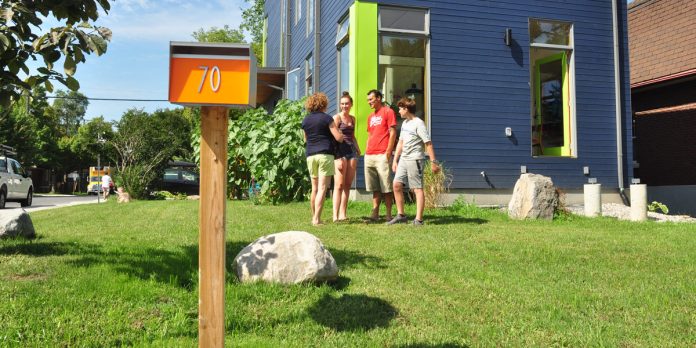
In Wellington Village, there was a little house at 70 Smirle Ave. at the corner of Spencer that had valiantly served its occupants for something in the order of 90 years. By 2017, however, the modest dwelling was showing serious signs of age. The occupants, Mike Leach, Kate Billingsley and their children, daughter Ngaire (16) and son Finn (13) had been living satisfactorily, although coping, frustratingly at times, with uneven floors and a deteriorating foundation for some 14 years.
Since Mike was involved in the construction industry, the couple decided a new house was in order and that the aging building would be replaced. (Mike’s firm is Kiwi Mike’s, and he describes himself as a general contractor who also builds.) The old 70 Smirle house came down on September 11, 2017 and the family moved in to the new 70 Smirle in May of this year.
A search for an architect led them to Paul Kariouk. “We had seen a house on Bayswater Avenue that he had designed and we liked it,” Kate recalls. “So we approached Paul to design our new home.”
Mike was born in Montreal where his parents – who hailed from New Zealand – resided for a period of time. Since then he has spent considerable time in New Zealand (and has the accent to prove it).
The three-bedroom house that Mike and Kate had Paul design is a marked departure from the new housing in the neighbourhood. Theirs is not a typical infill by any standard. Paul designed an airy, open concept, two-storey, rectangular home to sit about where the old house was on the 33 x 90 foot lot. At roughly 1700 square feet, their home is a pipsqueak compared the 3,500 square foot semis going up steadily in most Kitchissippi neighbourhoods.

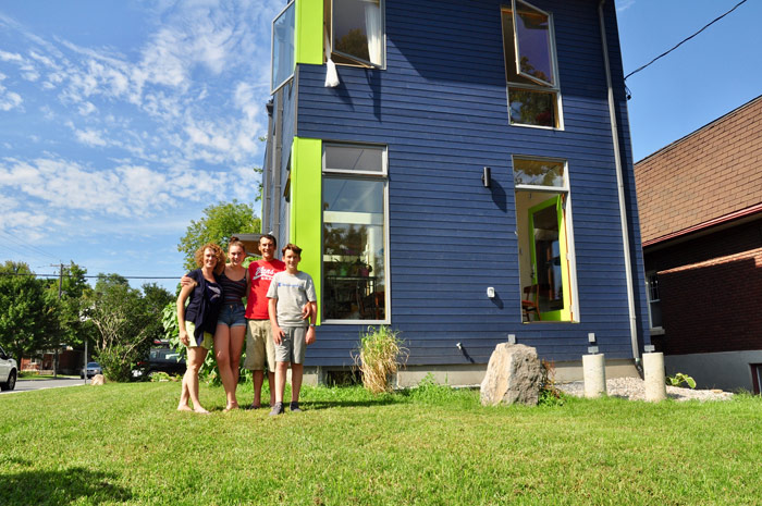
The structure faces east on Smirle Avenue with the south side of the house extending down Spencer Street. The low slope roof of the home, which includes two Velux skylights, slants slightly from west to east. The long expanse of the home’s sides are broken up with parallel two storey windowed voids crossing the width of the home from top to bottom.
One of Kate’s priorities was that the house should have an abundance of natural light. And while the voids help achieve that goal, building regulations limited them to only the amount of fenestration on the north side of the house facing their neighbours to seven percent, the same amount as their former house on that side facing the neighbour.
Further, the total square footage of fenestration, by regulation, had to be limited to 22 percent. Any more than that triggers an energy audit by the authorities. Still, even with those limitations, the home is nicely bathed in sunshine.
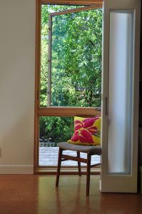
The bedrooms all have two large windows with the exception of Finn’s, which has one window and a roof top skylight. Mike acknowledges that windows are a significant factor in any house build. “Windows are a huge part of the budget,” he says, nodding to the Marvin brand wood and aluminum clad windows they ultimately selected.
“I bet we went through ten iterations of windows before we settled on these,” says Mike. “David Sneyd of Window Works off Clyde Avenue was extremely patient with us.”
Maintaining the setbacks defined by the old home, along with new regulations, meant that the home, while maintaining the same width of the old house, could be lengthened to about 50 feet and not require minor variances. Despite that, new regulations required the couple to increase the setback on the south side of the house facing Spencer to seven feet.
The plans call for a deck that wraps around the home from the south side entrance and extends around the rear of the building. The completion of the wrap around deck and the front porch are important projects remaining on the “to do” list for Mike.
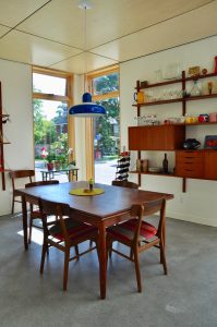
The first floor plan includes a dining area and powder room at the front of the house with the kitchen/eating area in the centre. Given my personal interest in antiques, I couldn’t help but comment on the 1970’s teak dining room set, which Kate points out, had belonged to her parents. Teak wall mounted shelving units hold important family pieces of china and glass and cheerfully complement the dining table and chairs.
A five-foot wide floor-to-ceiling wall with a passageway on either side of it divides the front dining area from the kitchen and informal eating area. The staircase to the partially finished lower level of the house is against the north wall.
Behind the only other wall on the first floor at the west end of the house, is a comfortable sitting room. The family expects the side entrance on Spencer, which enters into a space between the kitchen area and the sitting room on your left when you enter, will be the one they use on a daily basis.
A custom built staircase is situated against the north wall of the house and leads up to three bedrooms all on the south side of the house, including the one full bathroom in the house; although the toilet and another sink, by intentional design, are located in a separate small room directly across the hall.
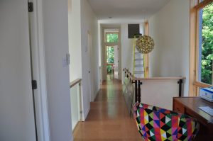
The upstairs floor is also concrete but topped with “burled” look, light coloured cork flooring which is soft but firm underfoot.
Past the staircase, the upstairs hallway expands slightly at the front of the house providing a convenient area for a desk and a cozy armchair for reading that sits beneath a window at that end of the hall.
Mike and Kate freely admit that the house they built is modest in size and scope. “We didn’t want a massive house with multiple bathrooms,” Kate notes firmly on our tour of the upstairs.
Mike took nine months off last year from his usual work to concentrate on building the new home. His knowledge of construction and building techniques is evident at every turn. From the polished exposed concrete floors on the first level, low sheen Baltic birch plywood panel ceilings (28 sheets in all), custom metal stair railings with hand rails, stainless steel kitchen counter unit and a long, custom made “butcher block” laminated wood peninsula for informal meals – this is one impressively modern house.
The Leach/Billingsley home also has advanced HVAC systems which includes a heat pump that delivers cool air to the ventless air duct units mounted high up on the wall on the second floor. There’s also an air exchanger unit on the basement wall. The house is so tight and well insulated there has to be a formal method of exchanging air, hence the exchange unit.
Water for showers (there’s no tub in the main bath) is supplied by an on-demand hot water system, which both Mike and Kate say is working nicely.
Mike concedes that the radiant floor heating in the basement level and first floor was expensive and that it’s pointless to discuss the length of time it will take to recoup that cost. “It’s the next owner of this house that will get the cost benefit on that one,” says Mike. However, he also notes that the in-floor heating negates the need for a conventional furnace and ductwork. Besides, he says: “If your clothes happen to be on the floor, they’re warm when you pick them up!”
While Mike took the lead on construction, Kate provided all the back-up support, which included on-line research for all of the fixtures, equipment and accessories in the home.
The exterior of the new 70 Smirle reflects Kate’s interest and love of colour. After painting colours on copies of the architects’ drawings, she opted for navy blue wood siding with lime green painted aluminum metal accent colours on the doors and similar coloured accent pieces on the corners of the house.
When you think about it, the old 70 Smirle was a reflection of its time and probably included some innovations and modern design features which were popular back then. It was a current and creative design that served its owners well, in a convenient and friendly neighbourhood.
In many ways, Mike Leach and Kate Billingsley took exactly the same approach with the new home at 70 Smirle. They built a modest yet modern home in a neighbourhood they love and which will serve them for many years – and likely other families – for many more years to come. After all, isn’t that what good home building should be all about?
Photo by Andrea Tomkins.
The KT “Who lives here” series takes a closer look at some unique homes and the people who live there. Which Kitchissippi-area homes are you most curious about? It could be an old home, a new one, a big one, or a small one. Email a street address and a photo to editor@kitchissippi.com and we’ll do the rest. To read other stories in this series, click here.
This feature is brought to you in part by Engel & Völkers Ottawa Central, Brokerage.
